By now
your spreadsheet looks pretty good. After following the instructions on the previous pages, you’ve got a worksheet
with shopping spree data that is organized and colorful.
Still, looking at numerical data listed in
columns and rows is admittedly a little dull, even boring at times. Some people have a hard time reading and understanding
information that is presented this way.
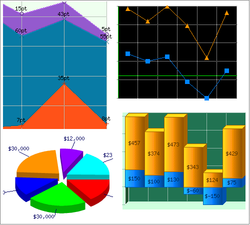
People are who visual learners like to see visual displays rather than lists
of data. These visual displays can be pie charts, bar graphs, bubble charts, etc.
Luckily, spreadsheet programs
allow you to create easy-to-read visual displays with just a few clicks of the mouse.